Design Systems
Unifying Design at NCR
I led the NCR Design Systems team through several iterations of NCR’s first design system. This is the story of a small multi-disciplinary team’s successes, failures, and lessons learned on it’s way to launch, maintain, and grow a multi-platform design system.
 2016 - 2020
 Project Director
 Hospitality, Retail, Financial, Platform
 Web, Mobile, ATM, Kiosk, POS, SCO

The Challenge
My team was tasked with creating a unified design language to establish a shared user experience, common visual vocabulary, and clear guidance around design best practices for composing digital experiences at NCR. Okay, that sounds easy... we would come to find out that it is not.
My Role
My role was the Director of The NCR Design System, but i didn’t start there. Throughout the life of the project I would take on many roles, which included FED, UX / UI Designer, Product Manager, Researcher, Mentor, and tireless advocate and promoter of design within the company.
Chapter Zero: Problem Statement
Houston... We Have a Problem
Right from the start, this project faced immense challenges and difficult questions. How do you create a design system for hundreds of unrelated products? What happens when you apply a single design system across an expansive technology landscape? How do you not only get buy-in, but an investment, from product teams that did not previously prioritize design, or their user?
The Problem
As NCR began pivoting from a hardware to a software-focused company, they faced rationalizing a sizable software portfolio. Designed in silos, the products lacked consistency of both user and brand experiences. No thought had been given to a cohesive centralized design strategy. Worst of all, nobody considered the user when designing the products!
Historically, engineering teams designed products "on the fly" as they went. Product team members touting themselves designers did the same. Even the obligatory "nephew of a manager" got in on the design party -- true story. To say there was a deep inconsistency among the products would be an understatement. To say they failed to serve the needs of their users became increasingly apparent.
The Solution
The UX Team was challenged with addressing the disjointed user and visual experiences across the vast product landscape, which numbered hundreds of unrelated products. To make it even more complex, the portfolio spanned a variety of platforms: Web, Mobile, ATM, Kiosk, Self-Checkout, and Point-of-Sale. The applications render on a variety of devices and screen sizes along with custom-built NCR hardware as well.
Our solution was to create a unified and centralized design system. This design system would empowers our designers and developers to create solutions to challenges based on a common set of shared principles, best practices, and ever evolving design guidelines. It would be “One system to rule them all”!
The Objective
The objectives of the design system was to improve UI consistency and quality, reduce redundancy, and create a unified experience across the NCR ecosystem through a curated system of living guidelines, components, UX patterns, and features. The design system would collect, archive, and catalog the well-reasoned and researched decisions made on our products, which would increase its value over time and help facilitate the breaking of silos. It would become an ever-growing ecosystem of design assets and guidance that would enable our designers to focus on solving NCR’s unique challenges instead of creating redundant theming and designing/re-designing base level components that are already well established and battle tested.
As a service to our developer community, the NUI Design System would be provided as code as well. The product teams could then utilize the code resources to get up and running faster and stay in parity with the ever-growing design guidelines. Although not required, they would be encouraged to do so.
Chapter One: Discovery
You Don’t Know What You Don’t Know
We had to start somewhere, and this would take the form of a deep discovery process. With that came much discussion around the architecture and scope of the solution. Both of these things would evolve considerably as we progressed. Over time, we had revelations that would change our direction along with distractions and hurdles that would throw the project off track... yet, we kept learning and adapting.
Audits
In the beginning, we had to make sense of that vast landscape of projects, so we started with audits focused on our flagship products. From these audits we were able to create a matrix of elements, components, and patterns already in use. This gave us a better understanding of the most common affordances already out in the wild while also helped us become more familiar with the existing product landscape. These initial audits seeded the first version of the design system.
As the system grew, audits of existing work would become one of the core tenants of our design system process. As we sought to gather the discoveries, research, and designs of the product designers working on the front lines of our product to feed the system, we found that they were frequently “too busy” to contribute. We would come to realize that we needed to be proactive to gather ideas for components and patterns, which could then become candidates for inclusion in the design system.

Desktop Audit

Mobile Audit
“Competitive” Analysis
At the outset of the project, nobody on the team had built a design system at this scale. We came to find there were a lot of people who were solving similar challenges to ours, and they were sharing their experiences. Many design systems were public and were open sourced as well. This became a huge advantage to us as we used our analysis to validate our ideas, defend our positions, and borrow when we could. One thing that we learned and took to heart was that keeping it simple, well documented, and flexible were keys to being successful. One of the biggest lessons? You can’t do all the things - even if you want to… and trust me when I say - everyone will expect you too.
User Input & The Feedback Loop
As familiarity becomes the enemy of perspective, we had to make sure to continuously gather outside input about what we were doing. Luckily for us, the main user of the system was the UX Design Team we were a part of. This gave us easy access to the people who would be using the system day-to-day. Collaborative input and feedback was easy to gather in the beginning, but as our team grew and became increasingly more distributed, this would prove more difficult. Throughout the life of the project we implemented several different modes of discovery to gather our users needs and assess their goals. To get feedback, we interviewed the team in group and one-on-one sessions, set up and conducted surveys, and implemented feedback forms on our documentation site to continuously gather input. This information would then be used to shape our roadmaps, address concerns, and drive priorities.
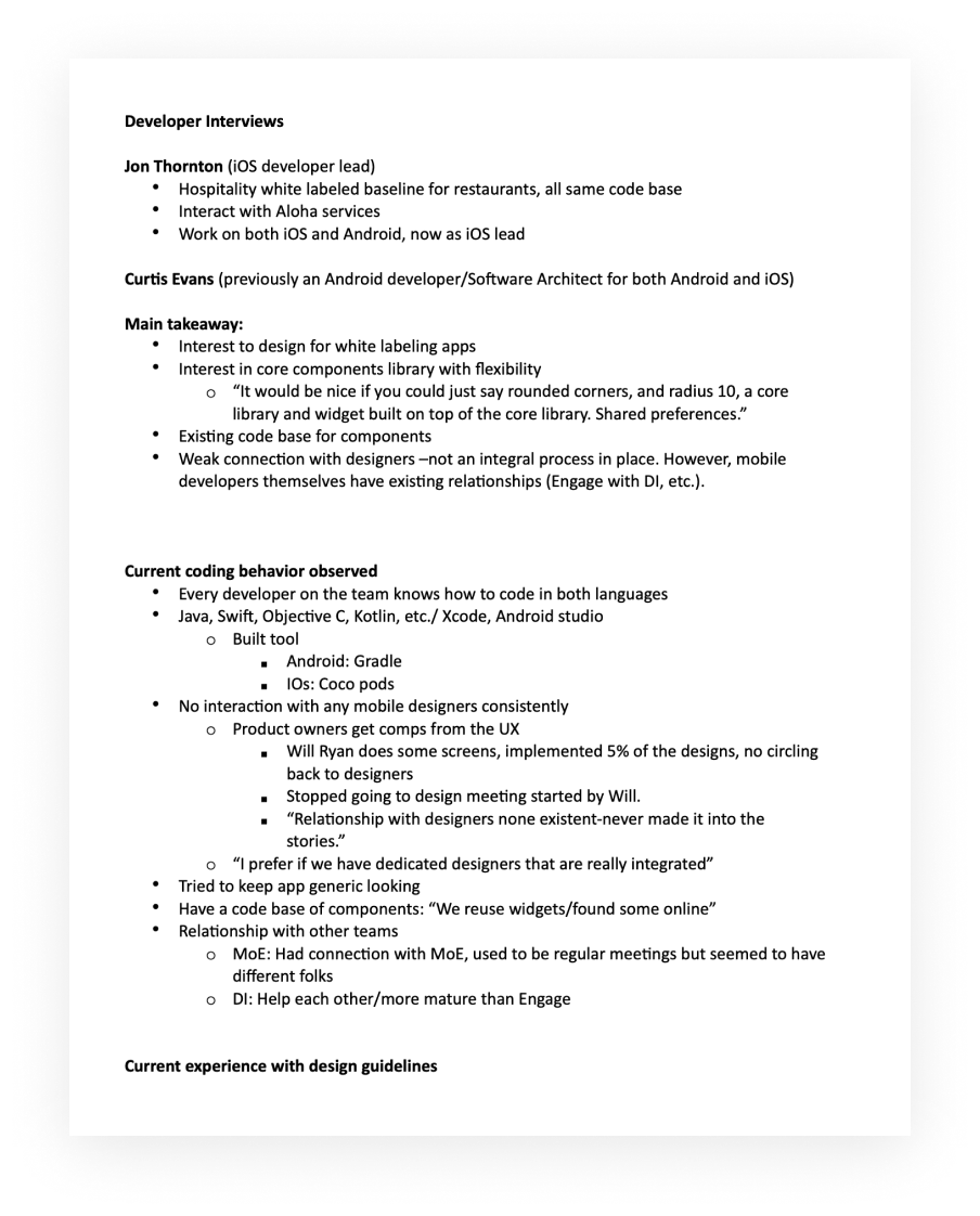
We conducted user interviews to get additional insights
It was a bit more difficult to gather information from the engineering teams. Their day-to-day entailed working with an embedded designer assigned to their products. As a result, we were getting second hand input from the engineering teams through our designers. So, I set out to build relationships with these engineering teams by opening direct lines of communication. We made it our mission to meet with any and all teams that would meet with us. If a team reached out for any reason, we would request a meeting. From these meetings we began to gather information about the products, such as, technology stacks, product roadmaps, and contacts, etc. We built relationships. As a follow up, I would then assign a point of contact and we would commit to support them as needed. Overtime, this gained us goodwill and buy-in from the product and engineering teams we interfaced with. This also gave me a new platform to evangelize design to anyone who would listen.
Truthfully, I don’t know that we mastered creating a highly effective feedback loop. In hindsight, I found this to be one of the most difficult to establish parts of our process. It is hard to do, but the importance was never lost on us. Our original mandate was to establish and maintain a system where designers and engineers would proactively add back to the system to help grow it. There’s not a lot of incentive for engineers, or even designers, to do this. It happens, but not enough. I found that being proactive about going out and getting what you need is necessary. I learned to establish relationships early, set up regular meetings to get input, and learn what is and is not working from our users. This was critical to being successful.
Stakeholders & The Governance Model
In the beginning, our key stakeholder was the Senior Director of UX. She was the head of design at NCR. She worked closely with the executive and software leadership teams to give us our marching orders. She would update them on our progress and get feedback. This seemed simple enough. By proxy we would have our key stakeholders input to drive our direction and we would work as a centralized design system team. This worked fine for establishing an initial design system. Eventually, we would find out that this model does not scale well.
As the system grew and it was leveraged by more and more products, it became clear that we would need a new method to address and include emerging stakeholders. Our governance model had to evolve. We began working on a cyclical governance model. In this model we would act as the centralized team that were the custodians of the system. We would include a federated governance body to help make strategic decisions. We would then encourage users of the system to evolve and grow the system as needed based on their requirements, then contribute their work back to the design system.
Chapter Two: Make
Time to Make the Donuts... I Mean Components
With the goal of creating a comprehensive and well rounded resource for team’s creating digital experiences at NCR, we focused on creating internal tools to help enable their success. Our goal was to create a solid set of resources that could be used as a launch pad, not act as a straight jacket. Getting the core building blocks of the design system right was key to providing a solid foundation for success to our users.
Internal Tools
Documentation Site - At the heart of the design system is the Documentation Site. We created a custom documentation site tailored to our content. This resource centralized the tools and guidance of design system. It gave our users a single source of truth for our content. They were also able to get the latest updates, links to additional resources, and give us input or make requests through our feedback forms.
Design Guidelines - These are a set of visual design and interaction guidelines focused on high-level design concepts, component usage, and LOB and technology specific implementations. Early versions of our design system did not have this, which was problematic. This is arguably one of the most difficult parts of the system to make. Creating these guidelines takes time, expertise, and a strong design opinion. We leaned on your product designers and study systems in the wild to gather ideas and best practices to augment our system.
Design Resources - This consists of assets such as iconography, color palettes, fonts, spacing, and so on. The resources we created were optimized for enterprise applications that tended to be data heavy with much to parse. We focused on clean, decluttered interface elements that used color with intention and prioritized the visualization of data. We started with our brand guidelines, then expand on them as needed based on the circumstance.
Components - Components are the bell of the ball. They have a tendency to be the most discussed and debated part of the system. They consists of the fundamental building blocks of an application, such as, cards, tables, filters, and so forth. They can be as basic as a button, or as complex as a navigation menu. Designers and developers will be use them to assemble their interfaces, so this can be where the rubber meets the road for them.
OOur system was comprised of component designs along with accompanying documentation. But, we also provided the component as code so development teams building out the design system based designs quickly. As we updated the designs, we would update the code base so that it was effortless for products to stay up-to-date with the latest styles.
Pattern Library - Patterns are reusable solutions to the most common design problems. An example would be Login. Why should each application have a unique login? We saw an opportunity to save our teams time by establishing a reusable login pattern based on standards and best practices. This is something that brought immense value to the system through efficiencies in production and a shared user experience across products.
Human Guidance
No matter how good the internal tools are, you will need to provide human guidance to your users for a better shot at success. We factored in time to work with our product designers to align their designs with our system, answer questions, and mentor. For developers, we would often give on-on-one code walk throughs and embed on their team to get them up and running. We were committed to empowering our teams to produce higher quality work and in return we hoped to improve our design system.
Chapter Three: Iterate
Nurture & Grow
You would think that once you launch the system it is all down hill from there. That couldn’t be further from the truth. This is where the real work begins. You quickly find your resources spread thin as you takes steps to support, maintain, and grow your system all at once. Don’t underestimate the politics and problems that will surely come as well. There will be a lot of hard lessons and good feedback at this stage. This is where you must stick to the game plan and be ready to make adjustments.
Support
We would easily commit 25% of our production time to supporting our users. Frequently, we would over commit to supporting an effort in hopes of create success outcomes for our users, and ultimately the design system. Additionally, we saw it as an opportunity to promote the system and get buy-in from product and engineers teams, not just our designers. This was another step that helped build trust and created advocates throughout the company.

The Design System’s reach spanned many different LOB’s, products, features, and device types
Evolution
As the project progressed, so did the use of our design system. With that came more requests and additional expectations. Often, It was necessary to fall back on our prime directive as outside pressure was put on our team and our system - The Design System would always be a few steps behind production. It will be informed by the well-reasoned and researched work being done on products. It will grow through contributions back to the system from our designers on the front lines.
We frequently re-examined where we stood and what we wanted to accomplish, then made changes as needed. These discoveries lead to continuous growth and expansion and lead to the creation and launch of 3 major versions of the systems.
Design System: Version 1
As we began creating the initial version of the design system, it quickly becoming problematic. Due to internal politics, we were made to hitch our wagon to an internal effort in the throes of a rapid rebuild of an aging monolithic product. Unfortunately, this led us to use this product as the basis for the designs system. This would come to throw us wildly off course and we would feel the impact for years. In the end, we had an design system specific to this specialized application and our code was in the form of page templates for its specific pages. I was very vocal about not doing this, but at the time I was just a new resource on the project and not it’s director.

Version 1 of the Design System was a cross between a legacy products existing design and some newly emerging styles and patterns
From a development standpoint, when other teams wanted to use the system they had to break up the page templates and extract the component and styles they needed from a fragile monolithic codebase made for that specific implementation. From a design standpoint, some of the components had begun to be very specific to this product and weren’t appropriate for general use. Also, due to the need to move rapidly, existing anti-patterns and legacy components had made their way into the design system.
Recognizing this wasn’t scalable or sustainable as the basis for the design system, we made the bold decision to abandon the existing version and rebuild from the ground up. This would prove controversial. Several of our products had begun to use version 1 in production and they weren’t too keen on making another investment to rebuild.
Design System: Version 2
Version 2 gave us the chance to take a step back and re-examine where we were, how we got there, and were we wanted to go. We knew we had to get back on track creating a more generalized system that was flexible and could serve a greater audience. We also knew that we needed more documentation and more importantly, our components needed to be discreet pieces of code.
Although Version 1 had problems, it had some good parts and we focused on those. We started by extracting the design resources and re-evaluating. We iterated through color palettes, fonts, spacing rules, iconography and the like. We updated the system with a more thorough series of assets - complete with documentation.

Version 2 of the Design System was a complete rebuild from the ground up with updated styles, components, and improved usability
Next, we did the same thing with components. We threw out obviously poor and anti pattern elements and started fresh. We rebuilt every component from the ground up and documented them in our guidelines. Although there was still some rough edges, it was starting to shape up to be a stable and respectable design system. At the very least, it was better organized, better documented, and much more functional than the previous version.

The Component Documentation on the design files included details on specs, implementation, and usage

The Design System was comprised of discrete components and their variants to make assembling interfaces more efficient
Version 2 is where we added guidelines for ATM and Mobile applications in addition to our Web Documentation. We were starting to tackle the different branches of technology that NCR specialized in. This made our system more useful and more versatile, while allowing us to serve a greater audience.

The Mobile version of the Design System launched with v2.0
The last piece of the puzzle was the code base. We took the need to provide our design system as code very seriously because we knew the immense convenience and time savings it could provide. Code parity amongst applications and ease of updating would be an asset to the business — if we could get everyone to use the same code base.
We built the core system in vanilla HTML and CSS. This allowed it to be used in any tech stack, on any product. We then built parallel AngularJS and React libraries, which used the vanilla version as a dependency. Because we have been interviewing our development teams since the beginning of the project, we knew that 99% of all products were built using AngularJS. This would become our primary code base in Version 2, and it would become widely used.

Documentation Site v1 shows code, usage, and style guidelines for each component on the component pages

Documentation Site v2 allowing us to cater to different audiences by created a seperation of concerns between desgin and code
Icing on the cake came in the form of our first custom documentation site, which we published on the NCR intranet. This would be the home of our design system. We went to great pains to create a clear, scalable, user friendly intranet presence for our design system to live. This gave us our first form of centralized communication with our audience and it was a big hit. We would go on to launch 2 versions of the Doc Site before we deprecated Version 2 of the design system. After we created the first version, we learned not to underestimate the effort it takes to create and maintain this. It is a project within a project.

The Documentation Site was the single source of truth for the Design System. It contained guidelines for Web, Mobile, and ATM
Design System: Version 3
Version 2 was a built from scratch system. All components, patterns, guidance, assets, resources and so forth were created in house and maintained by our Design Systems team. The team was small — growing, but small. The design system was in the wild and the need to support, maintain, expand it had grown exponentially. Our team was stretched thin. Our progress in growing the system had slowed. We found ourselves spending inordinate amounts of time discovering, designing, and documenting basic things such as tabs and tables. These had already been designed a million times, I thought. There had to be a better way. How could we get to stage 3 of our design system quicker?
Stage 1 was guidelines and assets. Stage 2 was components and code. Stage 3 was a pattern library and a focus on advanced features that could solve problems specific to NCR. This would bring additional value, such as, a research library, product demos, additional platform specific guidelines, as so forth. We had made significant progress on Stages 1 and 2, but we barely scratched the surface of Stage 3. This was because of the significant cost of support and our focus on populating the system with basic components and assets that we were creating from scratch. Our momentum was waning. I challenged the team to come up with a solution that could move us quicker towards our end goal. I was desperate to provide more value and see the system grow.

There are levels to the Design System game
The team proposed something radical. Abandon the bespoke design system that we had spent so much time creating — and promoting — in favor of a tried and true open source design system. Needless to say, I said no. In my eyes the penalty for doing so would be too great. The move from Version 1 to Version 2 already landed me in a few tense moments with stakeholders who had made investments in the earlier version and were not too happy about the prospect of updating again. There was a much wider user base now. I foresaw that as more pain, more blowback. I wasn’t sure we could take another beating.
On top of that, I had become a bit attached to our creation. I thought it had promise. I was proud of how far we had come. I knew more about it than anyone. I also knew better than anyone, what was best for it... or so I thought. I often think about how you are frequently the worst enemy of your product. You know, the forest for the trees thing? I re-evaluated my decision and I asked for proof it would work. The team went to work with the intention of convincing me, which they did.

Version 3 of the Design System came with an brand new Documentation Site
We proposed the change to the UX Team’s Leadership. We would base the foundation of the system on Material Design. We argued: Standardizing on Material Design allows our organization to leverage a well-vetted and thoroughly tested system of design, which comes with a litany of resources, documentation, code libraries, and tools for our design and development teams to utilize. This would save our product teams tremendous amounts of time and money because a majority of teams currently used it and they were already familiar with it. Establishing Material Designs as our foundation would free the Design System Team to work on NCR-specific additions to the Material Design system and so that we could address business needs more rapidly. We were not limited to what the system provided and we could continue to grow our design system through the extension of Material Designs guidelines, principles, tools, and resources.
They agreed, so we went to work. We quickly built out a Material version of our design system. We maintained much of our previous work, with a refresh of course. We built it on the architecture of the Material Design code base and retooled our design files to utilize their components, but skinned to our styles. Within a few short months we launched version 3 of the design system, build on Material Design.

Version 3 of the Design System allowed us to start exploring additional topics, such as Data Visualization

Layout Templates using the new components were assembled as starting points for common screens and to inspire the designers

We redesigned several organisms, such as the Shell, to create better usablity and align with the Material Design specs

The Component Documentation on the design files included details on specs, implementation, and usage as well
This version was well received. A majority of the development teams we talked to over the years used our previous design system in-conjunction with Material Design. This eliminated the need to implement and maintain two technologies. Additionally, the engineering teams were very familiar with using Material Design, so the learning curve was minimal — if there was one. Our designers were intimately familiar with Material Design as well. They were able to make an easy transition, too. Conveniently, our new engineering leadership team had been pushing the teams to avoid reinventing the wheel in favor of leveraging open-sourced community driven solutions, and this was right inline with their mandate.
Material’s documentation was more robust and thorough than ours. Their system was more mature and developed. We got the benefit of that instantly. With all of this foundational work immediately in place, we were able to begin to turn our attentions to more complex issues we needed to solve. Namely, the pattern library. And this is where I end the story. Contact me to hear what happened next.
Chapter four: Retrospective
The Good, the Bad, and the Ugly
Some say it is the journey that counts. I think in many ways that is true. I learning a lot from this project over the years — the importance of team work, building relationships, the power of communication, staying flexible, iterating, and getting back up after you fall down.
What I Learned
I learned that building a corporate-wide design system from scratch is not for the faint at heart. It is not easy work, although on the surface it appears to be pretty straight forward. I learned that collaboration is key to getting buy-in and investment early. This is important to long-term success. I also learned that in the absence of executive support and mandate, you can be facing an uphill battle. I learned that you will make enemies along the way. Not everyone is rooting for you. People with vested interests think they know what you should be doing, and when you aren’t - it can put you in their crosshairs. I also learned that the design system will be expected to do all the things, and do them well, and do them yesterday. Of course this is impossible, so you have to learn to be diplomatic. You have to listen and make sure your users feel heard while standing your ground and making your case. I learned that if you have a vision, you are resolute, and you have a good team behind you that you will get to where you are going - even though the road there is ever winding.
What I Did Right
Looking back, the key thing that I did right was building a strong, diverse, and opinionated team to join me on this journey. Each of my teammates were multi-dimensional talents. We brainstormed, debated, and compromised, a lot. In my experience, collaboration with talented people yields superior results to going it alone — every time... iron sharpens iron. Another thing I did right was to have a strong vision for our product, and I let that lead the way. It is easier to make decisions and guide an effort when you know where you are headed and where you want to end up. Something else I did right was to make adjustments as we went based on what we learned, what had changed, and what was/wasn’t working. I was willing to reimagine and adjust the vision if needed, or start from scratch if we had to.
What I Would Do Differently
If I had to do one thing different it would be to implement a more robust and inclusive governance system earlier in the process. I see the negative impact not having this established had on the project in the long term. When key people are not invested, or feel left out, it can create conflicts and long term issues that are not easy remedied. Another thing that I would have done differently is improved communication. Although I communicated often and in great detail, I sometimes didn’t realize that I wasn’t being heard by everyone in the way I had hoped. By diversifying my communication methods, allowing others to deliver communications, and not faulting the recipients for missed messaging, I could have capitalized on more opportunities that otherwise suffered or languished. I am an effective communicator, but I can look back and see that this is something that I could have tweaked at times to maximize my effectiveness and others understanding.